Money moves between people.
The design should understand that.
Abaaly Payments · Consumer fintech · Mobile
Pay a friend. Settle a bill. Use a virtual card. These are everyday jobs, but each one asks someone to trust the product with their money. I designed Abaaly around making those moments easier to understand.
I led the product design, connecting onboarding, identity checks, everyday payments, and the social side of the experience. My focus was keeping the product familiar while making important money decisions explicit.
Lead Product Designer
Product management, frontend and backend engineering, and QA
Product journeys and screens, below
Request a walkthrough
Overview
Start with the person moving the money.
Abaaly brings payments, bills, virtual cards, and social interactions into one mobile experience for people in Nigeria. The opportunity was to connect these jobs without turning the app into a crowded menu of financial features.
I worked across the product structure, user journeys, interface design, and reusable patterns. Product and engineering partners helped define delivery constraints; I made those constraints understandable at the level of a real task.
Challenge
Familiar should still feel dependable.
A casual interaction can become consequential very quickly when money is involved. I needed to make sending money approachable without making the recipient, amount, or transaction state easy to miss.
Help someone understand what identity information is needed and what they can do next.
Make the recipient, amount, and payment state clear before and after a transfer.
Connect several financial jobs without giving every feature the same visual weight.
Discovery & strategy
I looked for the moments that needed reassurance.
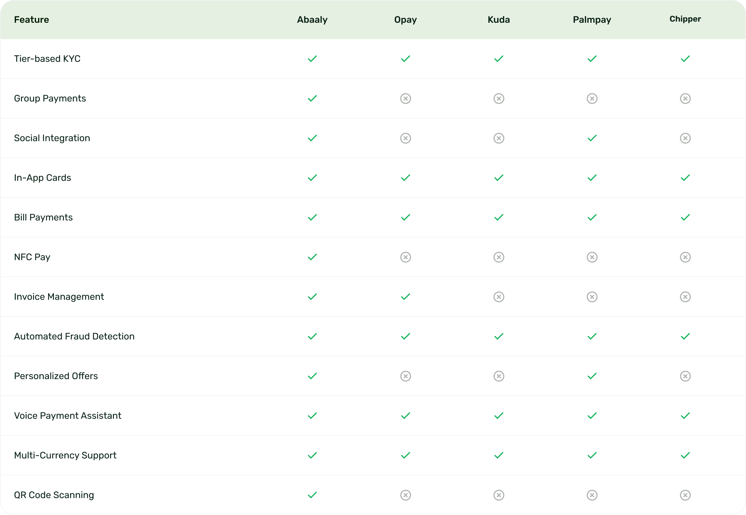
I used the existing research and competitor review to frame the product around trust, access, and everyday use. I paid particular attention to identity requirements, shared payment tasks, and the questions someone might have before using a virtual card.
An identity check needs a reason and a clear next step. An unexplained request for personal information creates uncertainty.
A social experience can feel friendly while still making the financial details precise. The payment should remain easy to inspect.
Design decisions
Make the financial action easy to inspect.
Open a decision to see what I chose, the trade-off, and the question I would use to evaluate it.
Give identity checks their own explanation.
The choice. I treated verification as part of the journey, with a clear reason for the information requested.
The trade-off. A shorter form is appealing, but hiding the requirement only moves the confusion to a later step.
What I would check. I would check whether people can explain why the information is needed and identify the next available action.
Separate a conversation from a payment decision.
The choice. The social context helps people recognize who they are dealing with. The money details still need a deliberate review.
The trade-off. Keeping everything in one conversation can feel effortless, but it can also make the amount or recipient easier to overlook.
What I would check. I would check recipient recognition and amount review before measuring task speed.
Make room for more than a success state.
The choice. A payment journey needs to explain the current state and what someone can do next.
The trade-off. Optimizing only the happy path leaves the most anxious moments unresolved.
What I would check. I would review pending, failed, and interrupted transactions with engineering before treating the flow as complete.
Solution
One product. Several everyday money moments.
The product walkthroughs below show the design in context. Use the video controls to pause on a screen and inspect the hierarchy.
I organized the entry into the product around clear requirements and understandable actions. The interface should explain what it needs from someone before asking them to continue.
For transfers and bills, I focused the hierarchy on the financial task. Amounts, recipients, and progress need to stay clear even when the surrounding experience feels social.
A virtual card needs a clear place in the product and enough context for someone to understand its purpose. The design should support a decision, rather than rely on a feature name alone.
Outcomes & learnings
The value is in how the journeys connect.
The design gives Abaaly a connected mobile product direction across identity, payments, bills, and virtual cards. The important contribution was joining those experiences through a consistent structure and a clear approach to trust.
Identity and everyday money tasks share one product language.
Financial details receive priority at the point of action.
Reusable patterns give later features a familiar starting point.
What I would take into the next iteration.
I would judge the next iteration by the moments where people hesitate: identity requests, recipient review, and transaction status. In fintech, confidence is part of task completion.