Logistic Platform
Package Delivery
Operational System
Mobile Application
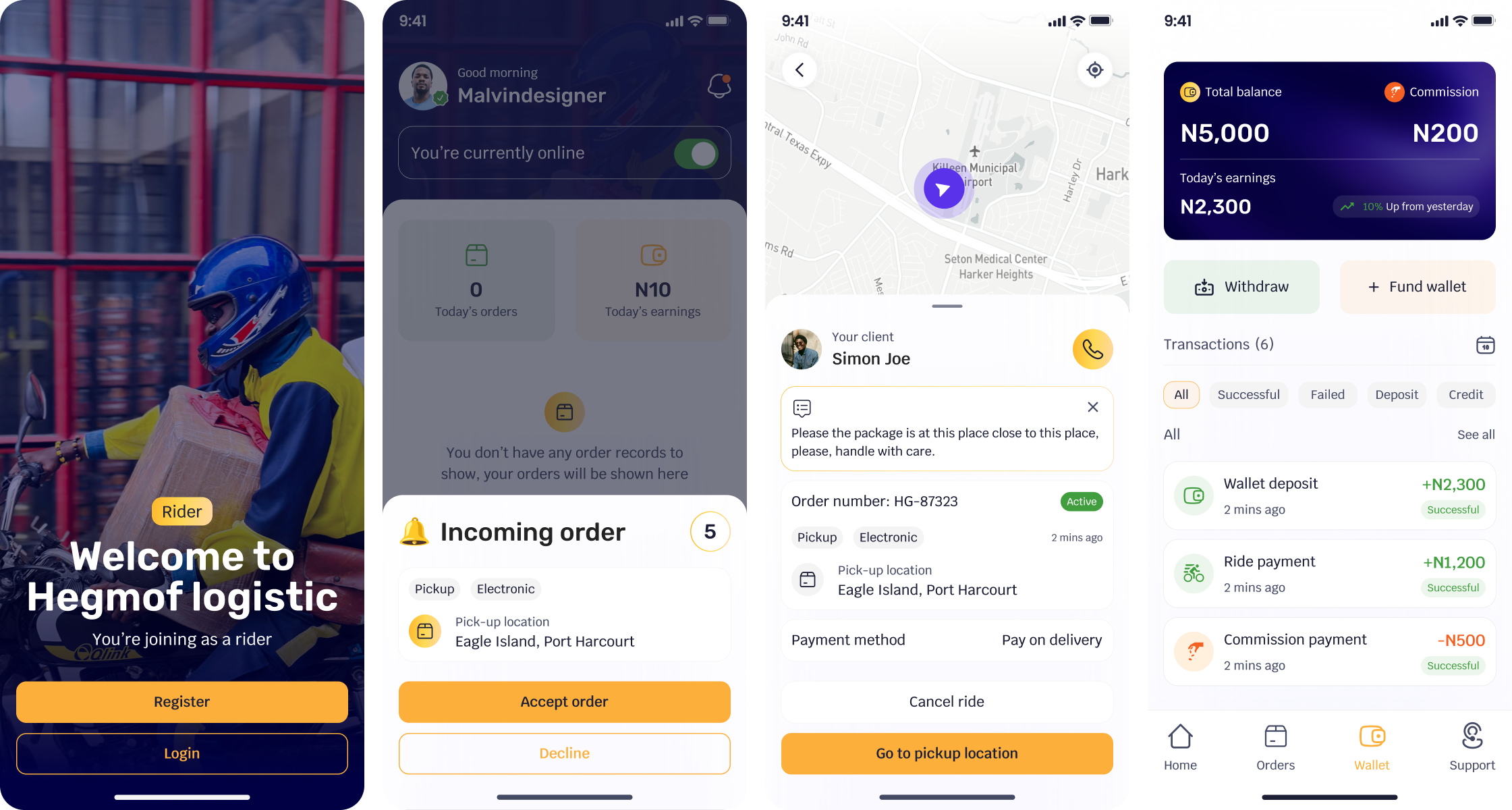
Rider
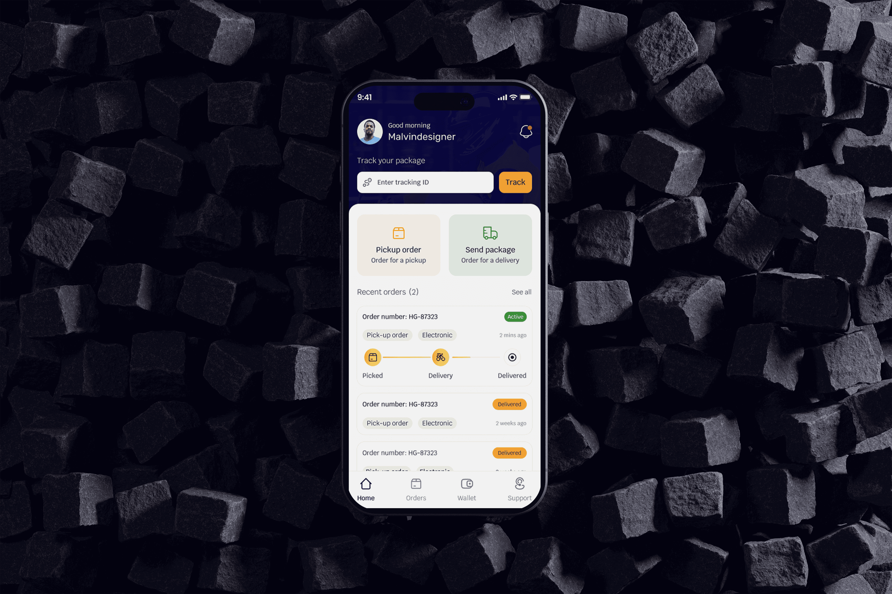
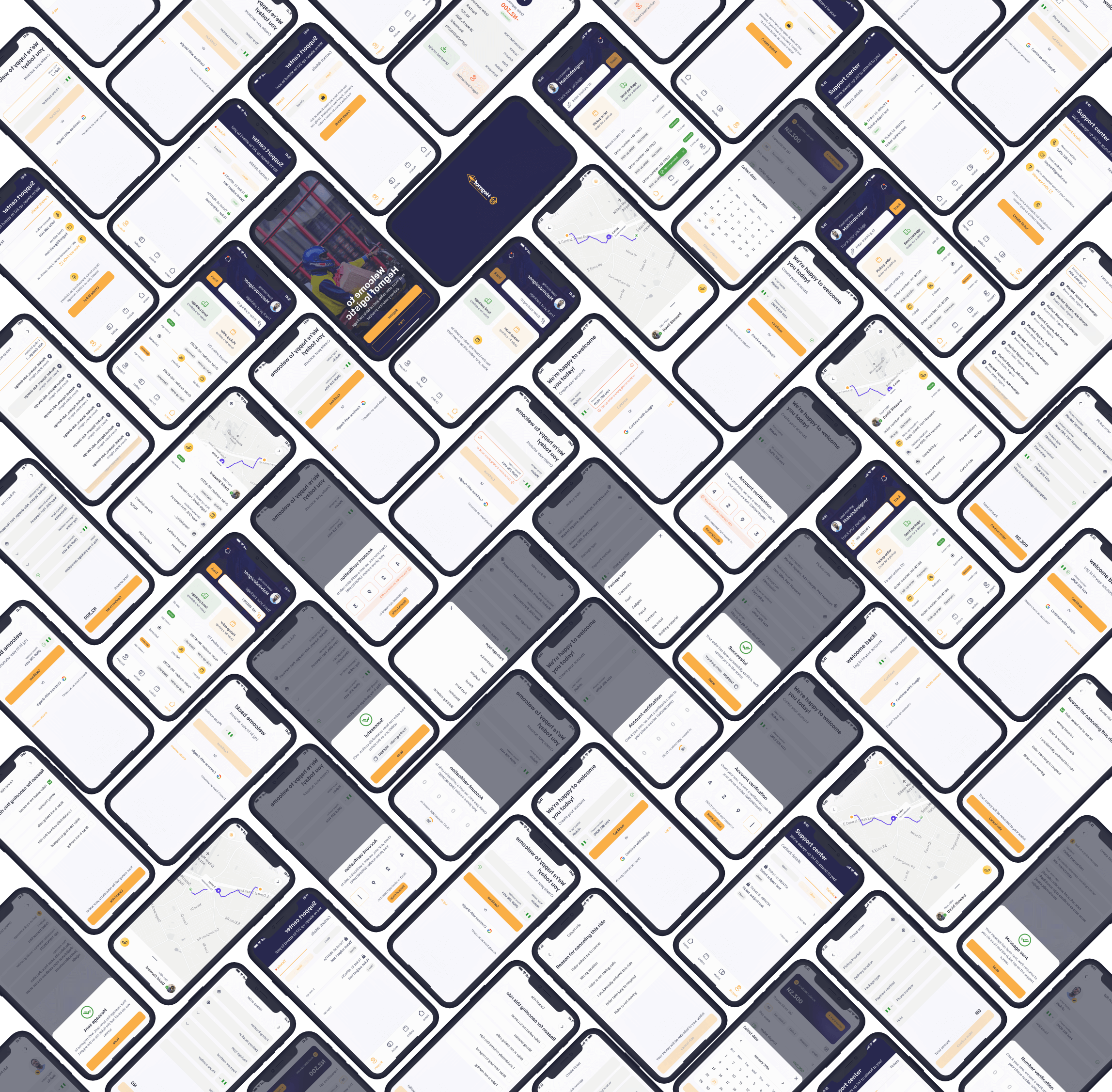
Hegmolf is a logistics platform built for package pickup and delivery in Nigeria.
I designed the experience across three connected products:
✅ Customer app
✅ Rider app
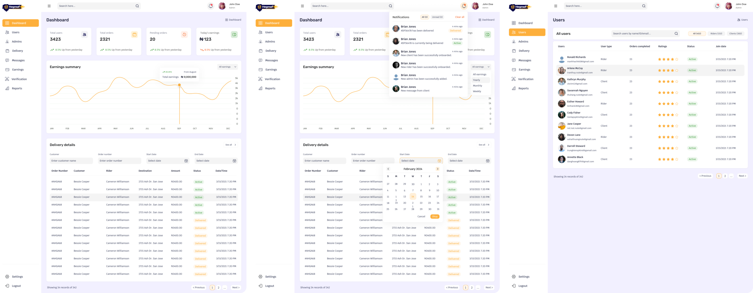
✅ Operations dashboard
The challenge was bigger than creating a delivery interface. Every customer action affected a rider. Every rider action affected operations. Every operational decision affected the customer’s trust.
My job was to make those connections feel simple.
My Role
End-to-End Product Designer
Platform
Web, Mobile App, Admin Dashboard
Project Duration
20 Weeks
Team
Product Manager, Product Owner, Front-End and Back-End Engineers
Core Responsibilities
Research, Product strategy, Information architecture, User flows, Interaction design, Visual design, Prototyping, Trust and safety, Design system, Developer handoff
Tools I used
Figma, FigJam, Miro, Maze
Customers moved from delivery intent to confirmed booking in about 2 minutes instead of 5, with fewer steps and less back-and-forth.
A simpler booking journey helped more customers complete their delivery requests instead of dropping off along the way.
A clearer landing experience helped more visitors understand Hegmolf and take the next step toward using the service.
A clearer assignment workflow helped operations connect deliveries with riders faster, reducing delays before a delivery even started.
Clearer tracking, delivery updates, and task flows gave customers and riders more reasons to stay engaged throughout the delivery journey.
Customers, riders, and operations now work from one connected delivery flow, making each handoff easier to understand and manage.
The Problem
The problem was bigger than delivery
Sending a package sounds simple.
In practice, several people have to make the right decision at the right moment.
A customer needs to create an order with the right pickup and delivery information.
A rider needs enough information to accept, collect, navigate, and complete the job.
Operations needs visibility into every active delivery so problems can be resolved before they become customer complaints.
The existing experience left too much of this work to manual processes.
💠 Booking was slower than it needed to be.
💠 Tracking lacked clarity.
💠 Operations had limited visibility.
💠 Riders needed a better way to manage assigned jobs.
💠 The business also needed a stronger digital entry point for new customers.
The product challenge became:
💠 How might we turn a fragmented delivery process into one connected experience
💠 Where customers know what is happening, riders know what to do next, and
💠 Operations can intervene when something goes wrong?
My Point Of View
My strategies for solving these problems
I did not treat the three interfaces as separate products.
I treated Hegmolf as one system with three different perspectives.
“Where is my package”
“What do I need to do next?”
“What needs my attention?”
This became the foundation for the product architecture.
The interface for each user could look different, but the underlying delivery state had to stay consistent.
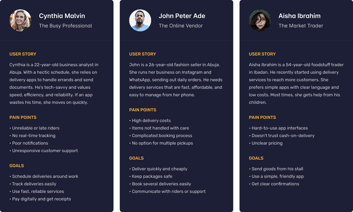
Understanding the people behind the screens
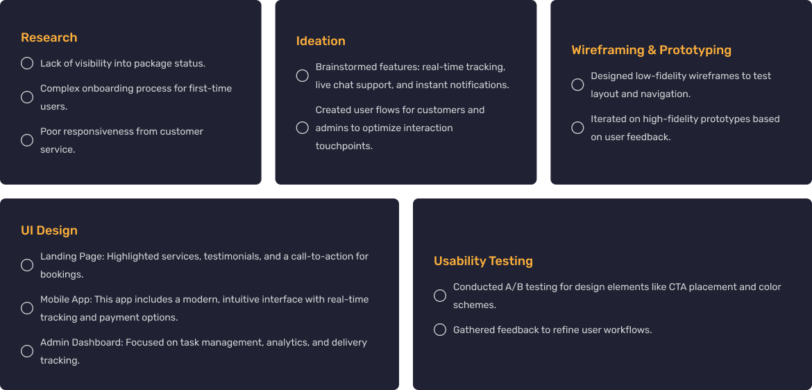
Before designing the interface, I needed to understand where the existing experience broke down.
I planned user interviews around the delivery journey rather than around individual screens.
I wanted to understand:
💠 How people currently book deliveries
💠 Where they became uncertain
💠 What information they needed before trusting a delivery
💠 What caused riders to delay or reject jobs
💠 How operations handled exceptions
💠 Which parts of the process depended on manual communication
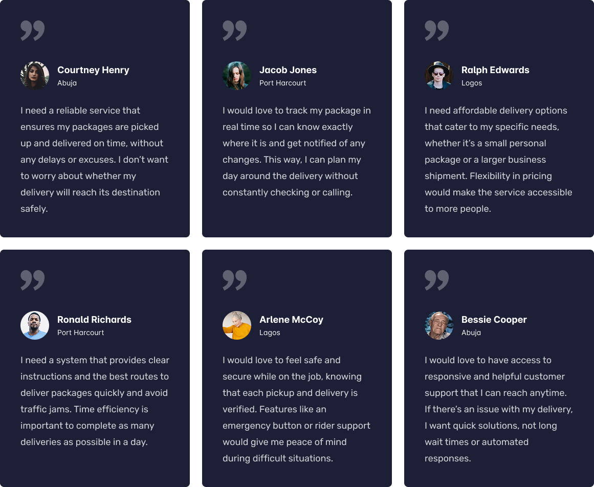
The research surfaced four recurring needs.
The delivery process created anxiety when users did not know what happened after booking.
The solution was not simply “add tracking.”
The product needed to communicate delivery status clearly at every important transition.
Riders did not need the same information as customers.
They needed to know:
💠 Where to go
💠 Who to contact
💠 What to collect
💠 What task comes next
💠 What happens after completing the task
This pushed the rider experience toward task completion rather than information browsing.
An operations dashboard becomes less useful when every delivery receives the same visual weight.
The dashboard needed to help teams identify what required attention.
💠 Late deliveries
💠 Unassigned orders
💠 Active deliveries
💠 Completed deliveries
💠 Problem cases
The design therefore focused on status visibility and operational priority.
The original booking experience took roughly five minutes to complete.
The opportunity was clear.
💠 Reduce unnecessary decisions.
💠 Group related information.
💠 Make the next step obvious.
💠 Keep users oriented throughout the process.
The research gave me four principles to design against.
Every primary screen should answer:
“What should I do now?”
Users should understand what happened, what is happening, and what happens next.
A logistics product needs to handle normal journeys and exceptions.
The interface should ask for information when the user needs to provide it, not all at once.
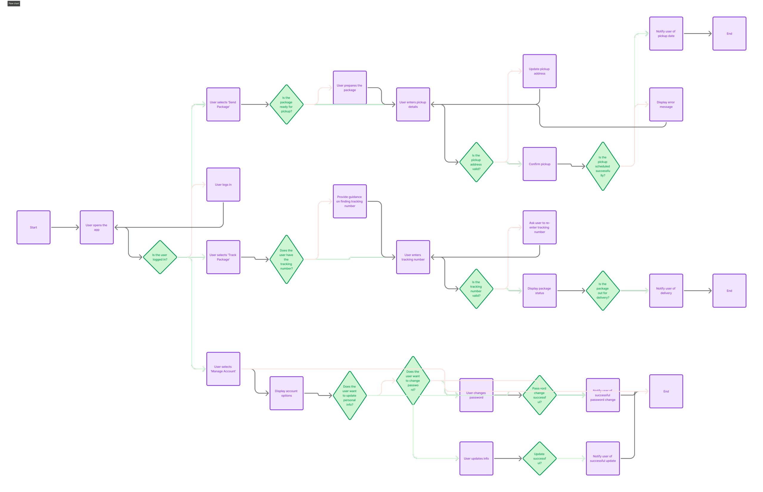
I created a systematic flow
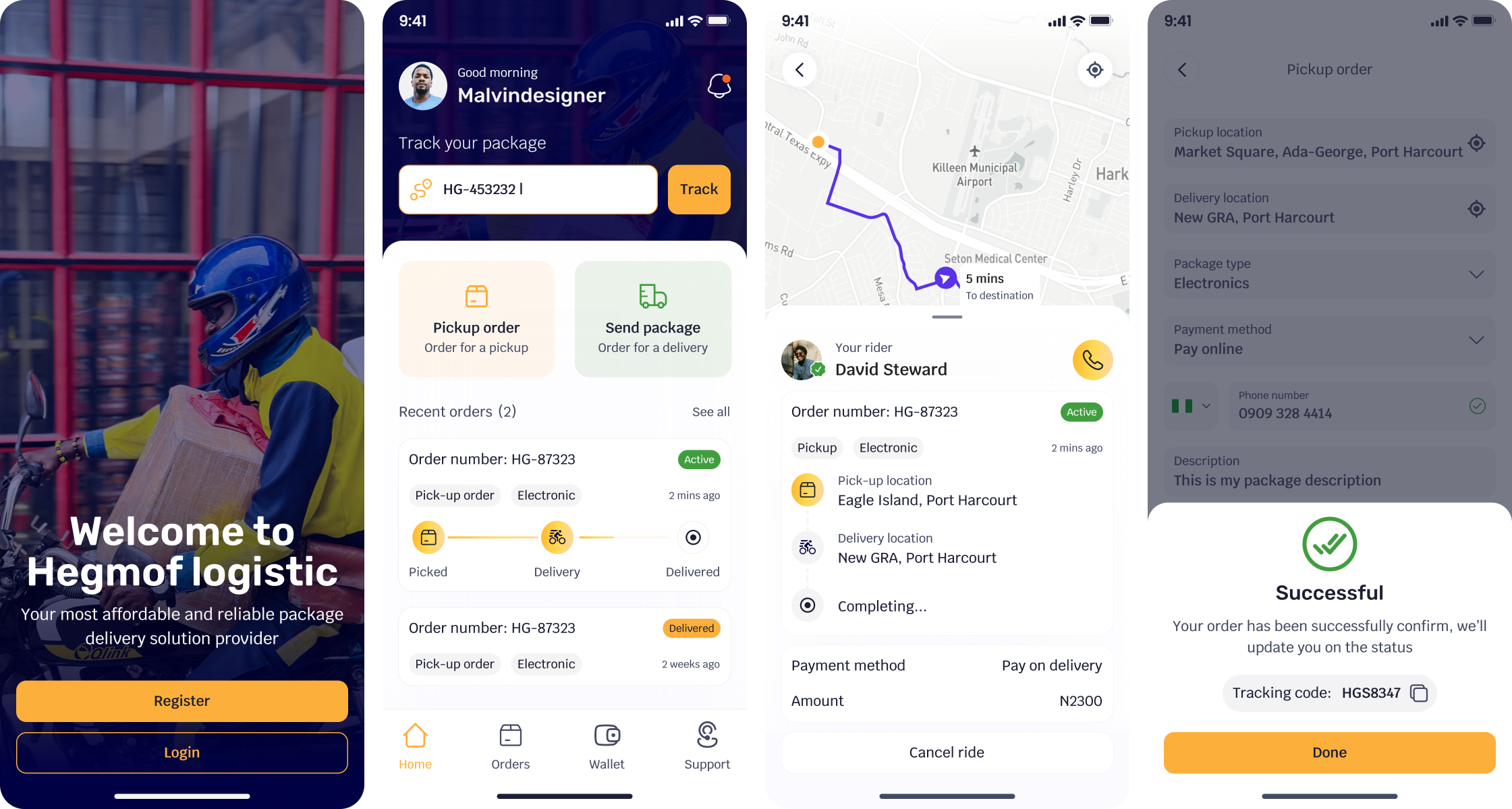
The most important customer journey was booking a delivery.
I mapped the flow before designing the interface.
Design Solution for Booking
The booking experience became the highest-leverage part of the customer journey.
The goal was to “Get a customer from intent to confirmed delivery with less effort and more confidence”
I broke the experience into focused steps rather than presenting one large form.
💠 A clear purpose
💠 Minimal required information
💠 Visible progress
💠 A predictable next action
The result reduced reported booking completion time from 5 minutes to 2 minutes.
Completed orders increased by 20%.
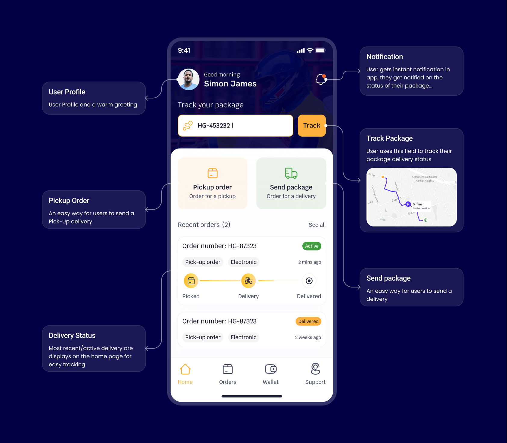
Design Solution for Tracking
Tracking is not useful when the interface only shows a moving location.
For Hegmolf, tracking needed to answer three questions:
💠 Where is my package?
💠 What has happened?
💠 What happens next?
I structured the experience around delivery states.
💠 Order confirmed
💠 Rider assigned
💠 Package picked up
💠 In transit
💠 Arriving
💠 Delivered
Design Solution for Riders
A customer wants reassurance. And a Rider needs efficiency.
I designed the rider experience around the active delivery task.
The main experience prioritized:
💠 Assigned deliveries
💠 Pickup details
💠 Drop-off details
💠 Navigation
💠 Customer contact
💠 Delivery status
💠 Completion
Design Solution for Operations
I separated the information into three levels.
What needs attention?
What is happening?
Why is it happening?
This allowed the dashboard to support both quick scanning and deeper investigation.
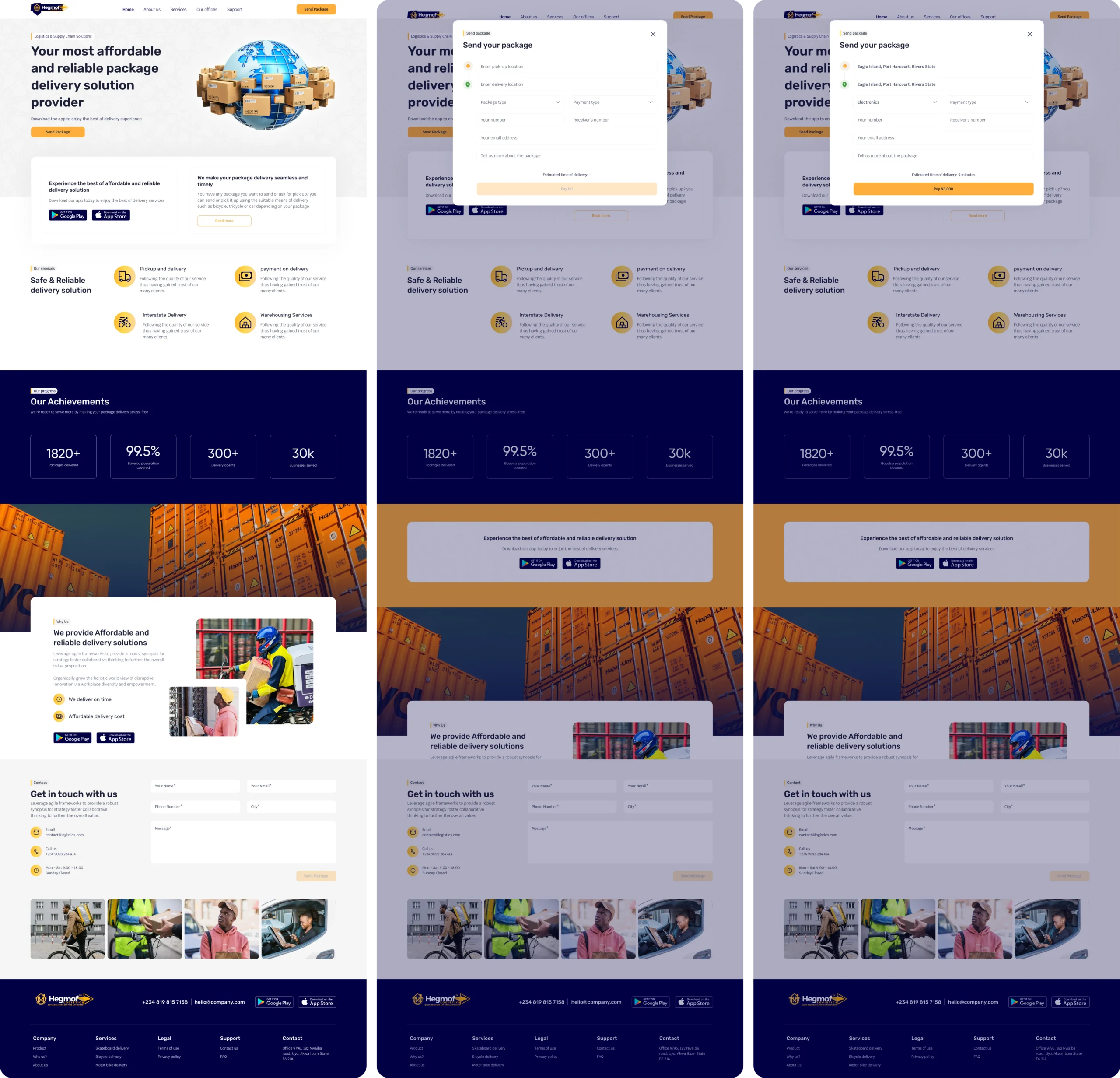
Design Solution for Landing page
The landing page had one job: help first-time visitors understand Hegmolf quickly and take the next step.
I focused the experience around three things: clarity, trust, and action. This approach follows common logistics UX patterns where booking and tracking sit close to the primary value proposition.
many limitations & decisions
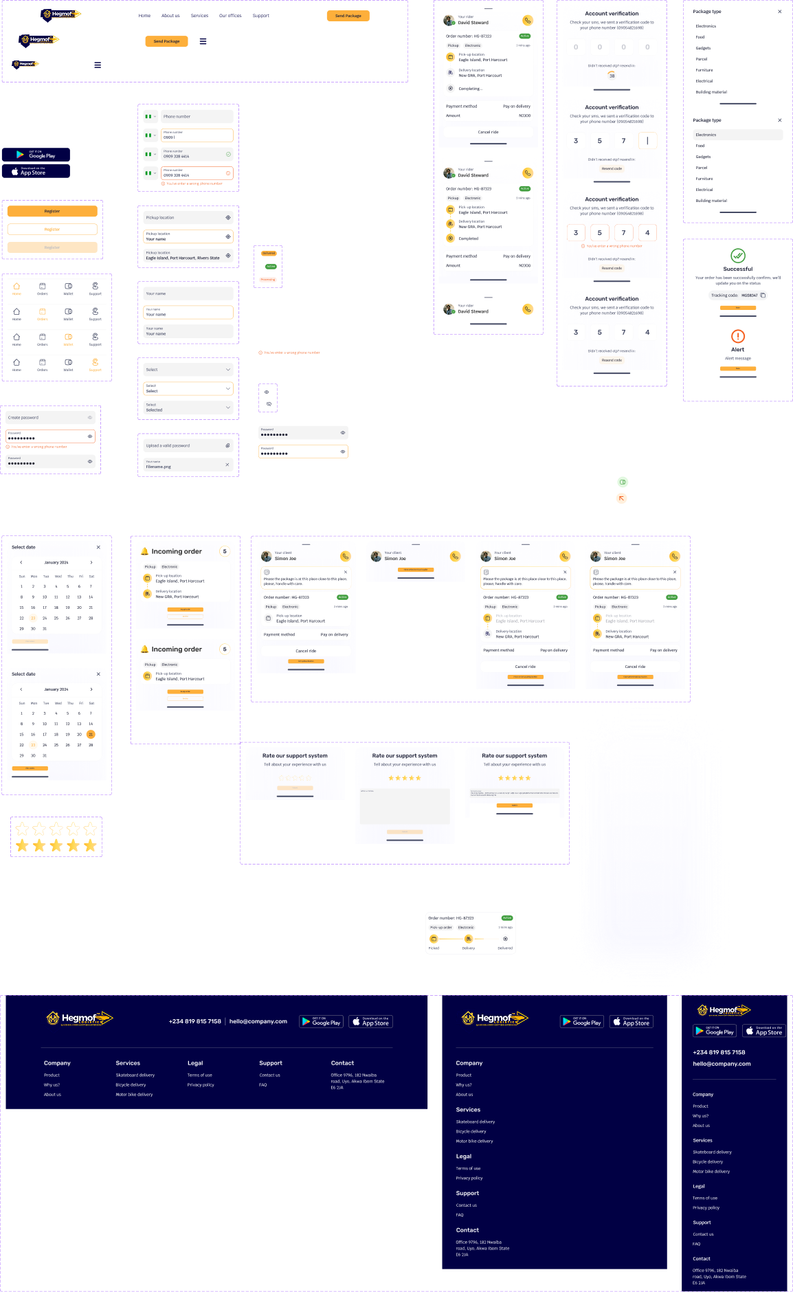
I worked closely with engineering to clarify interaction behavior, component states, edge cases, and handoff details.
The product had to work across a real operational environment.
The team included a Product Manager, three developers, and QA.
My role required constant translation between:
💠 User needs
💠 Business requirements
💠 Operational realities
💠 Technical constraints
Not everything was to be built
Good product design involves choosing what not to build.
One of the recurring decisions was balancing information density with operational visibility.
Customers needed simplicity.
Riders needed speed.
Operations needed density.
Trying to use one information hierarchy across all three would have weakened the product.
I therefore kept the underlying system consistent while allowing each interface to optimize for its user’s job.
That decision influenced navigation, hierarchy, content density, and component behavior across the platform.
Customers moved from delivery intent to confirmed booking in about 2 minutes instead of 5, with fewer steps and less back-and-forth.
A simpler booking journey helped more customers complete their delivery requests instead of dropping off along the way.
A clearer landing experience helped more visitors understand Hegmolf and take the next step toward using the service.
A clearer assignment workflow helped operations connect deliveries with riders faster, reducing delays before a delivery even started.
Clearer tracking, delivery updates, and task flows gave customers and riders more reasons to stay engaged throughout the delivery journey.
Customers, riders, and operations now work from one connected delivery flow, making each handoff easier to understand and manage.
The next phase would focus on making the system more resilient as delivery volume grows.
Give operations stronger workflows for failed deliveries, unavailable riders, address problems, and customer disputes.
Use historical delivery data to improve estimated arrival times.
Move from reporting what happened to helping teams understand why performance changed.
Audit the experience against accessibility standards and improve typography, contrast, touch targets, and assistive technology support.
Support critical rider actions in areas with unstable connectivity.
The most important design decisions happened where one person’s action became another person’s responsibility.
💠 A customer creates an order.
💠 Operations assigns it.
💠 A rider accepts it.
💠 The customer tracks it.
💠 Operations monitors it.
💠 The rider completes it.
I learned to treat research findings as design inputs rather than presentation material.
Each insight needed a consequence.
If an insight did not change a decision, it did not deserve a prominent place in the story.
The dashboard may not be the first screen customers see.
For the business, it is one of the most important.
A good operational interface reduces the effort required to understand and act on problems.
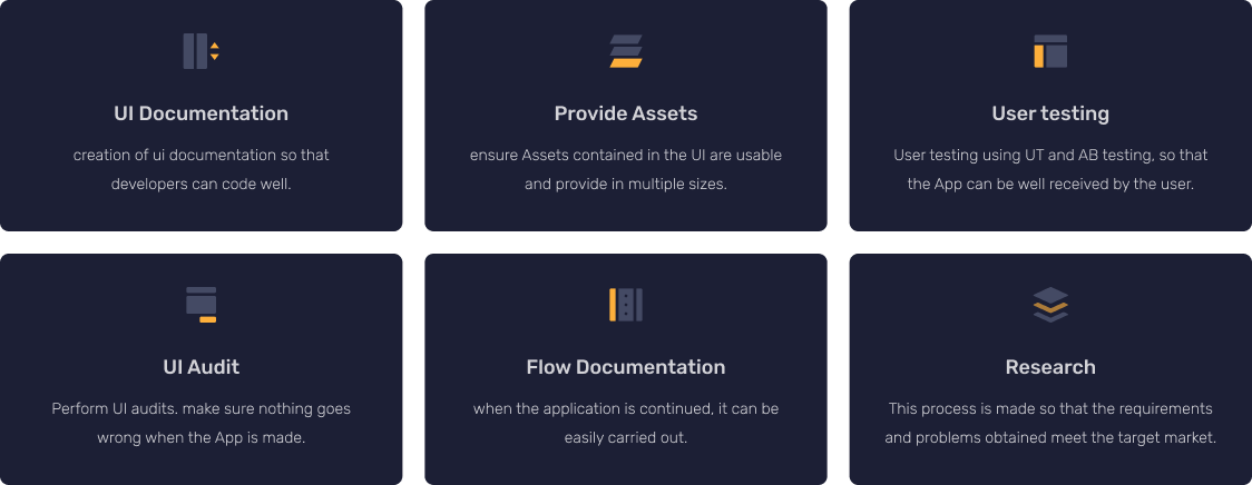
I owned the product design process from early research and information architecture through interaction design, visual design, prototyping, design systems, and developer handoff.
I worked with:
💠 Product Management
💠 Engineering
💠 QA
💠 Operations stakeholders
💠 End users
My contribution covered the customer experience, rider experience, operations dashboard, landing page, design system, and supporting product flows.
It was more than just logistics
Hegmolf started as a logistics app.
I approached it as a connected operating system for delivery.
The result brought customers, riders, and operations into one product model while giving each group an interface built around its own priorities.
The strongest part of the project was not any individual screen.
It was creating a system where each screen made the next decision easier.