Campus life is connected.
Its digital spaces should be too.
Solve-It · Campus commerce and community · Mobile
Need a second-hand item, someone to help with a task, or a campus update? Students often move between group chats, listings, and word of mouth. I designed Solve-It to give those everyday needs a clearer place to live.
I led the product design across marketplace, services, campus news, and forums. My work connected research, information architecture, flows, wireframes, detailed interfaces, prototypes, and reusable patterns.
Team
Lead Product Designer
Product management, frontend and backend engineering, and QA
Links
Product journeys and screens, below
Request a walkthrough

Overview
Build around the way a campus already works.
Solve-It brings commerce, services, information, and community into a mobile product for students in Nigeria. These activities already happen on campus. The design challenge was to make them easier to find and understand without flattening their differences.
The 18-week design scope covered discovering an item, evaluating a seller or service, starting a conversation, and participating in campus information and discussion. I approached the product as a connected campus experience rather than four unrelated feature lists.
Challenge
Finding something is only part of the job.
A listing can be easy to find and still leave someone unsure who they are dealing with. A service can look relevant and still be hard to compare. I needed to connect discovery with enough context to support the next decision.
Help students find an item and understand the person offering it.
Make it easier to compare a service and start the right conversation.
Give news and discussion clear places without overwhelming the transaction journeys.
Discovery & strategy
I separated the jobs before connecting the product.
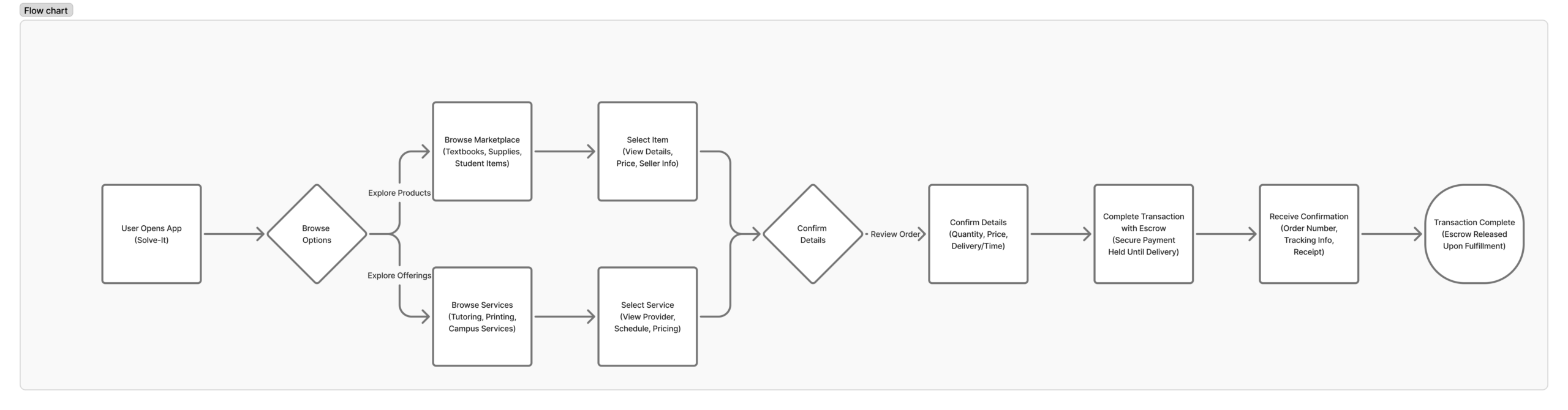
I used student research and the existing journey work to look at buying, selling, finding services, and sharing information. Then I mapped how those jobs should connect through a common product structure.
Profiles, reviews, and relevant product information help someone understand a listing beyond its image and price.
A service listing and a campus news item need their own content hierarchy, even when the navigation feels consistent.
Design decisions
Connect the experience without making every task identical.
Open a decision to see what I chose, the trade-off, and the question I would use to evaluate it.
Give the main campus jobs clear destinations.
The choice. I separated marketplace, services, news, and discussion in the information structure.
The trade-off. Combining everything in one feed might reduce navigation, but makes different intentions harder to scan.
What I would check. I would ask people to locate a product, a service, and a campus update from the same starting point.
Put useful context beside a listing.
The choice. I connected the item or service with the profile, reviews, and the route into a conversation.
The trade-off. Extra detail can compete with the primary action, so the hierarchy needs to reveal what matters at the point of choice.
What I would check. I would check what people review before choosing to contact a seller or provider.
Keep transaction and community patterns related.
The choice. I used shared navigation and visual patterns while giving conversations and listings distinct structures.
The trade-off. Reusing too much can blur the difference between buying, reading, and discussing.
What I would check. I would check navigation recognition across the different product areas before extending the system.
Solution
Explore three everyday campus moments.
Choose a journey to see how the product supports a concrete student need. Each set of screens is part of the same campus system.
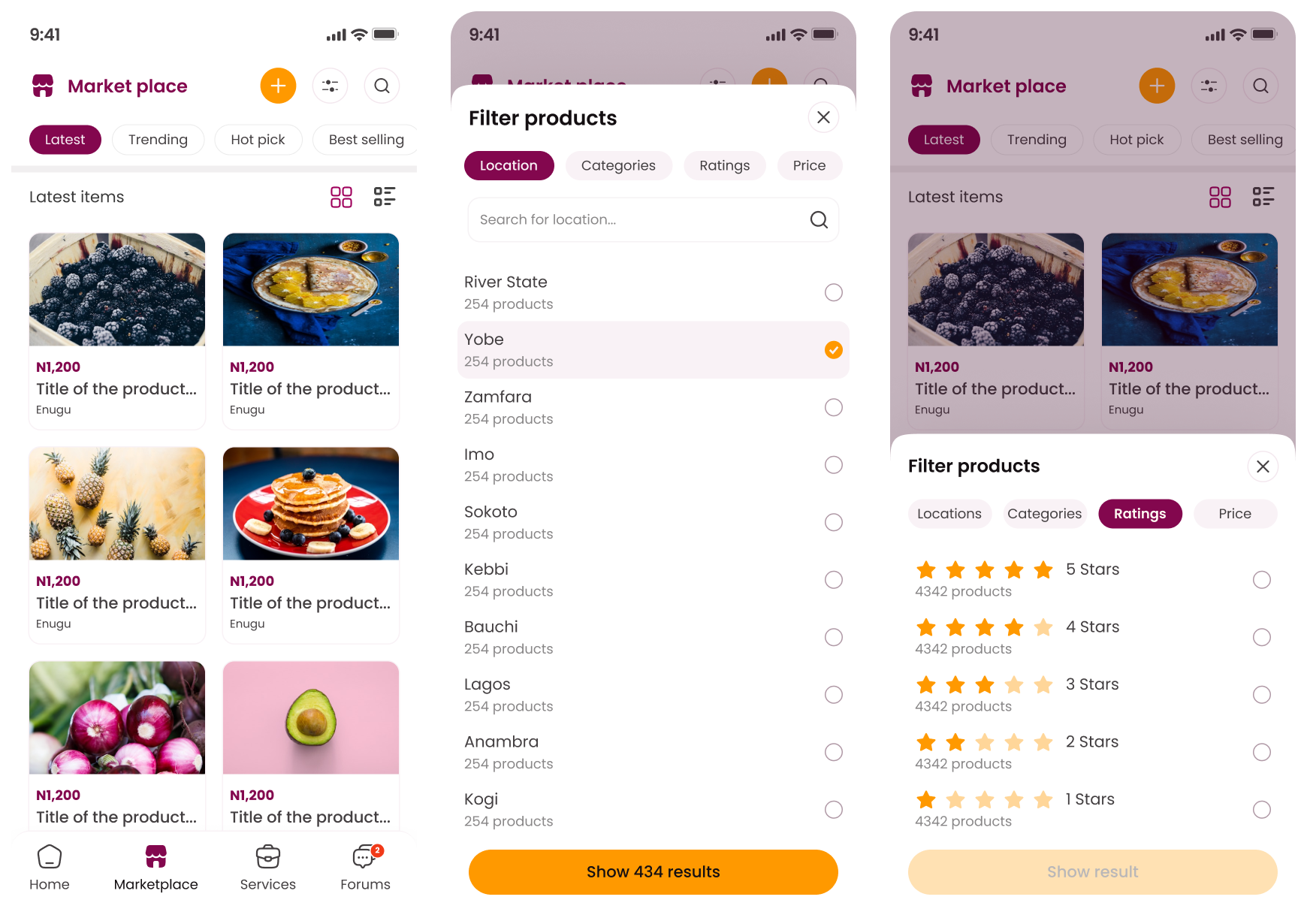
The marketplace brings categories, filters, and listing information together. Someone can narrow the options, inspect an item, and continue toward a conversation with the seller.
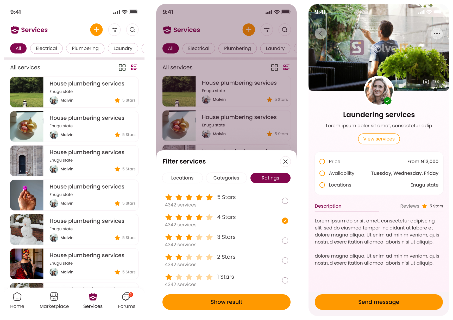
Services give providers their own context, with details and reviews close to the decision. The conversation becomes a clear next step rather than a separate search for contact information.
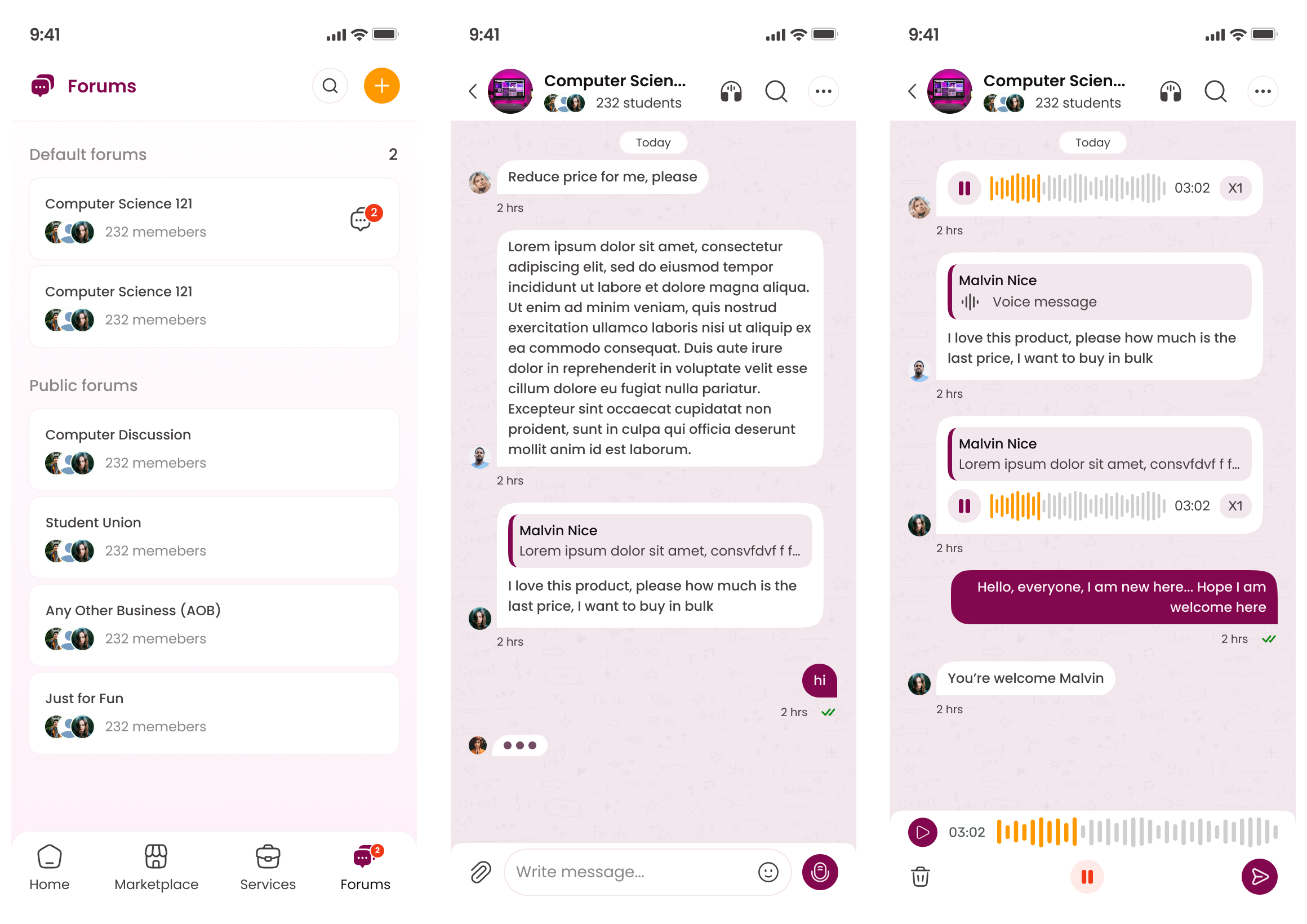
Forums organize conversations around campus topics. Shared navigation keeps this part of the product connected while the content supports a different kind of participation.
Outcomes & learnings
A clearer home for everyday campus decisions.
The delivered design connects commerce, services, news, and community within a shared mobile structure. It gives each activity a recognizable destination and a path from discovery into the next useful action.
The main campus jobs have distinct places in the product.
Listings connect with profiles, reviews, and conversation.
Shared patterns support different student needs.
What I would take into the next iteration.
For me, trust has to show up in the details of a transaction, not just in the product promise. I would focus the next iteration on first-time use, notification choices, and the way a dispute or failed transaction is explained.